


I was a UX Designer on a small team of Designers, Information Architects and Analysts to redesign IRS.gov from a old legacy system to Drupal 8. One of the major tasks that I was assigned to do was to conceptualized, architect, wireframe, mockup and prototype the navigation structure. This initiative was one of the many large efforts that IRS was trying to solve which involved numerous departments within IRS and numerous third-party teams that collaborated to build the heavily traffic website.
Problem
How can we help the U.S. public navigate efficiently throughout the website without calling in the call centers.
What are users looking for?
Top Pages: by views
Searches within IRS.gov
Device usage
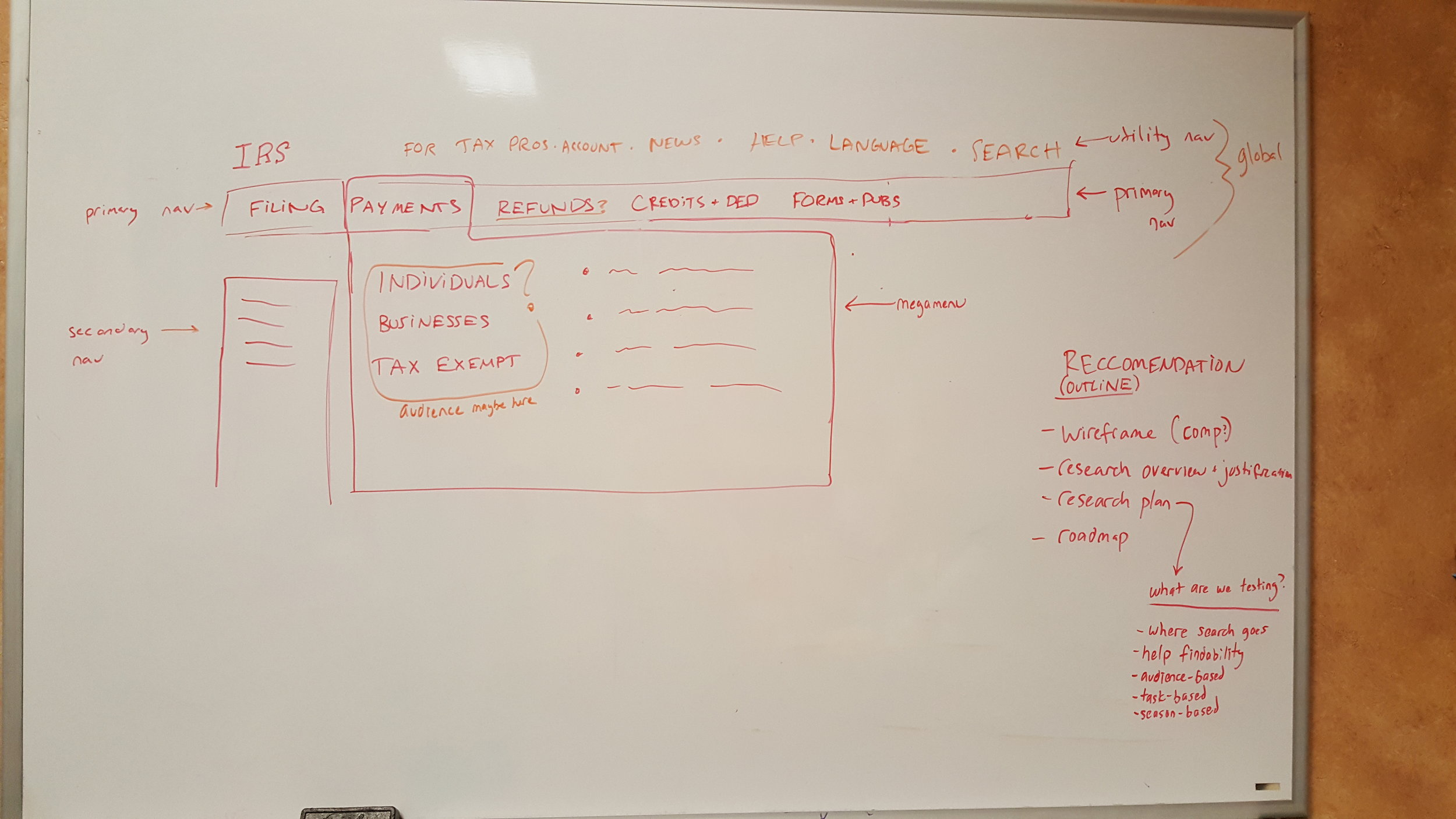
![20161214_135358[4].jpg](https://images.squarespace-cdn.com/content/v1/5086099ee4b0c9f0193ba8a3/1517775696455-JDE48PGDT2ZJ1CC35LYI/20161214_135358%5B4%5D.jpg)
Sketching and planning
With challenges in the approval process, the team wanted to whiteboard ideas for stakeholders to get their buy-in. This was also an opportunity to recommend research plans and how they would fit in the roadmap.
Next steps
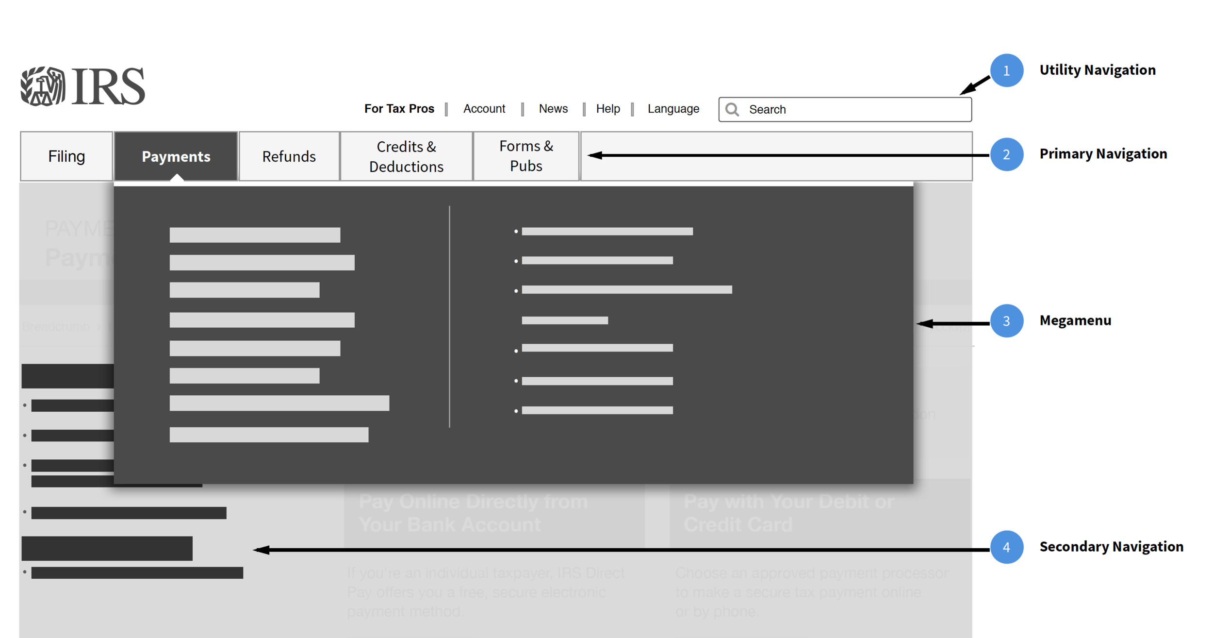
Determine three areas of the navigation: utility navigation, primary navigation, secondary navigation, and mega menu interaction
Content strategy to simplify content types
Work closely with stakeholders to finalize initial wireframes
User research plan in place to conduct usability testing
Challenging iterations and architecture
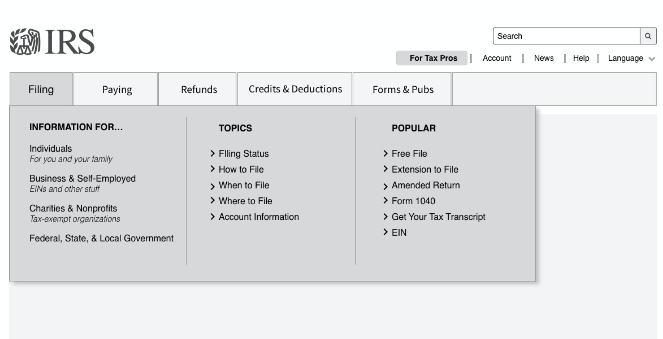
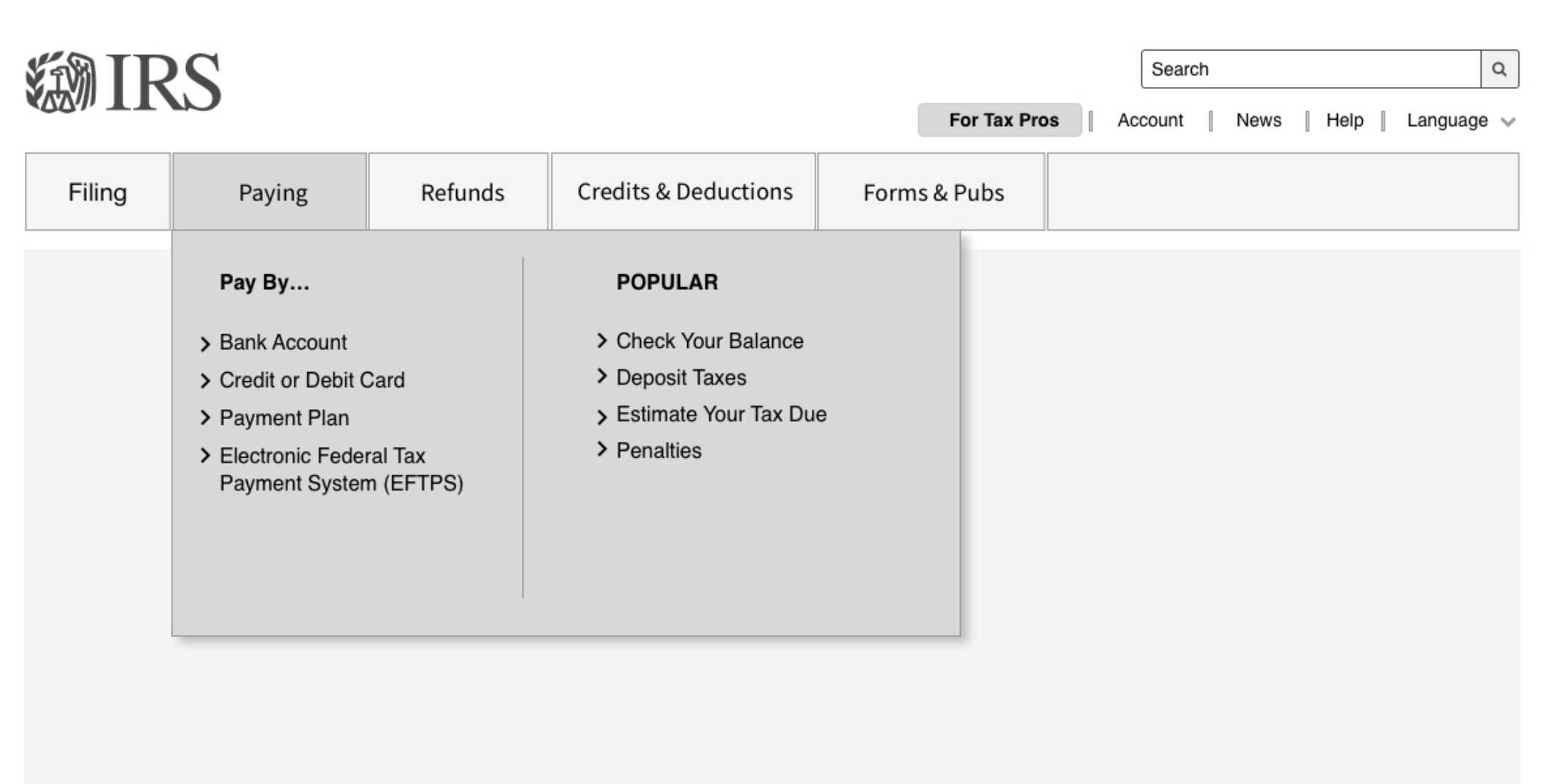
One of the challenges the team had to face was the back and forth communication through numerous workstreams. I had to keep up with the constant changes from the stakeholders while working closely with the UX team with any design changes that came along. During this process, we went through 12 iterations on the mega menu content and designs. These iterations helped the stakeholders understand the information architecture and gave them the confidence to conduct usability testing for the next steps.
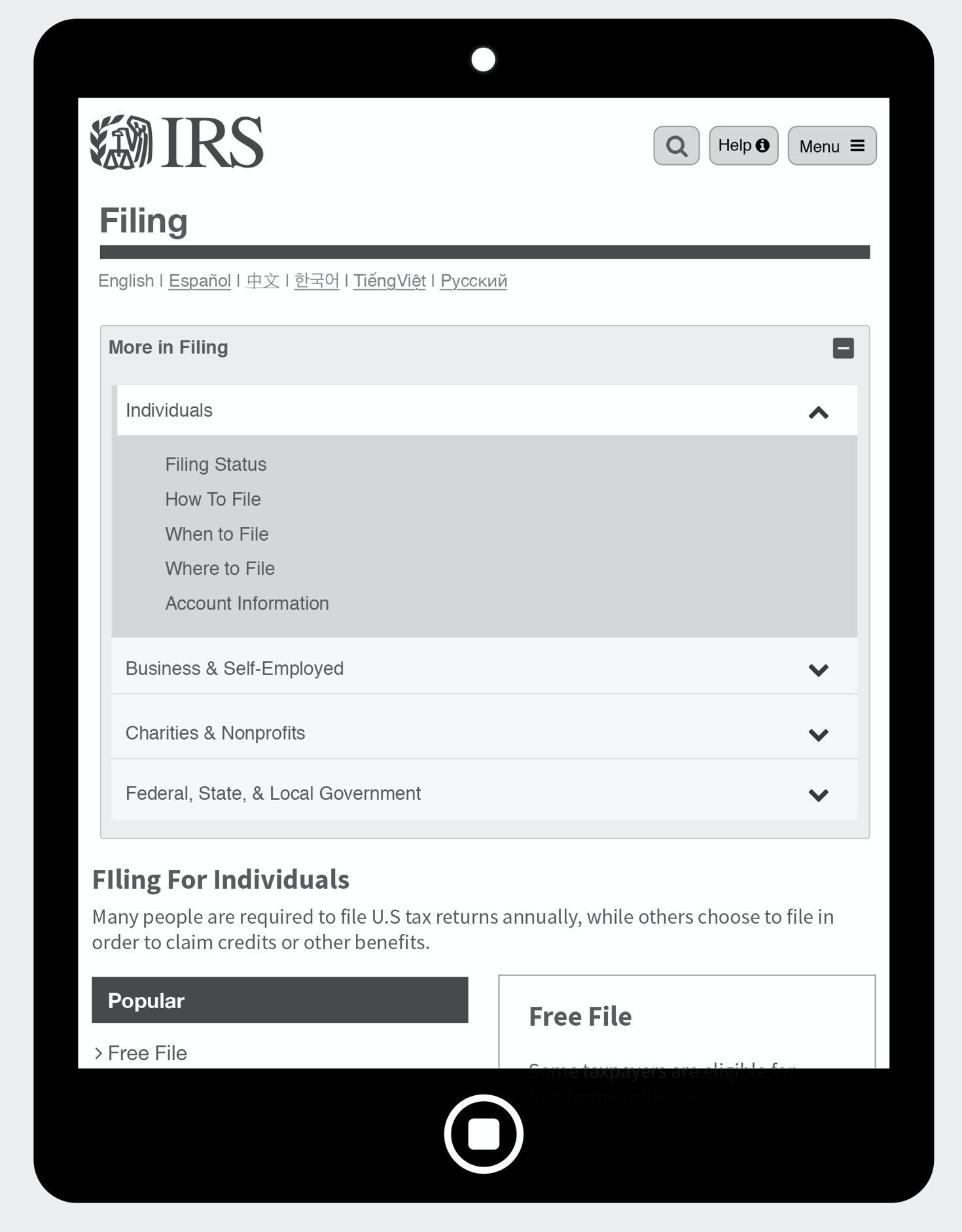
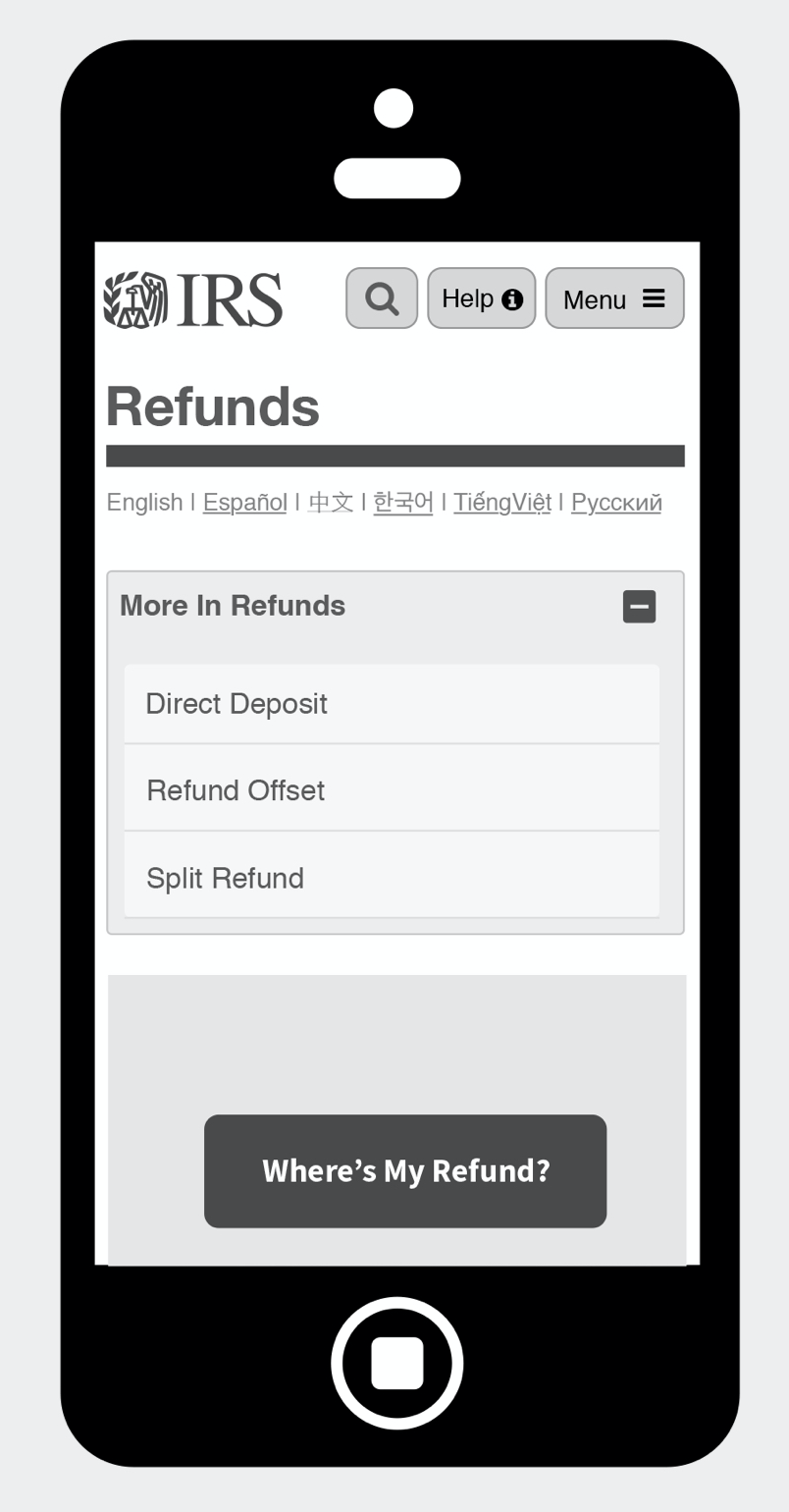
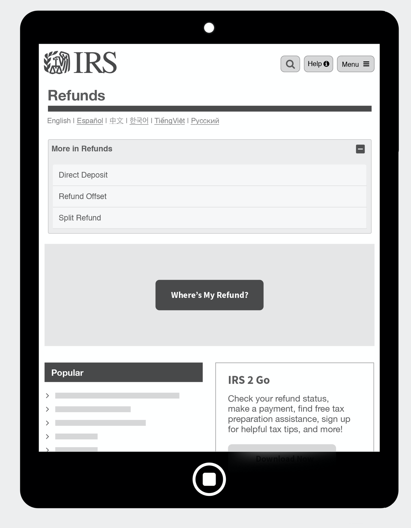
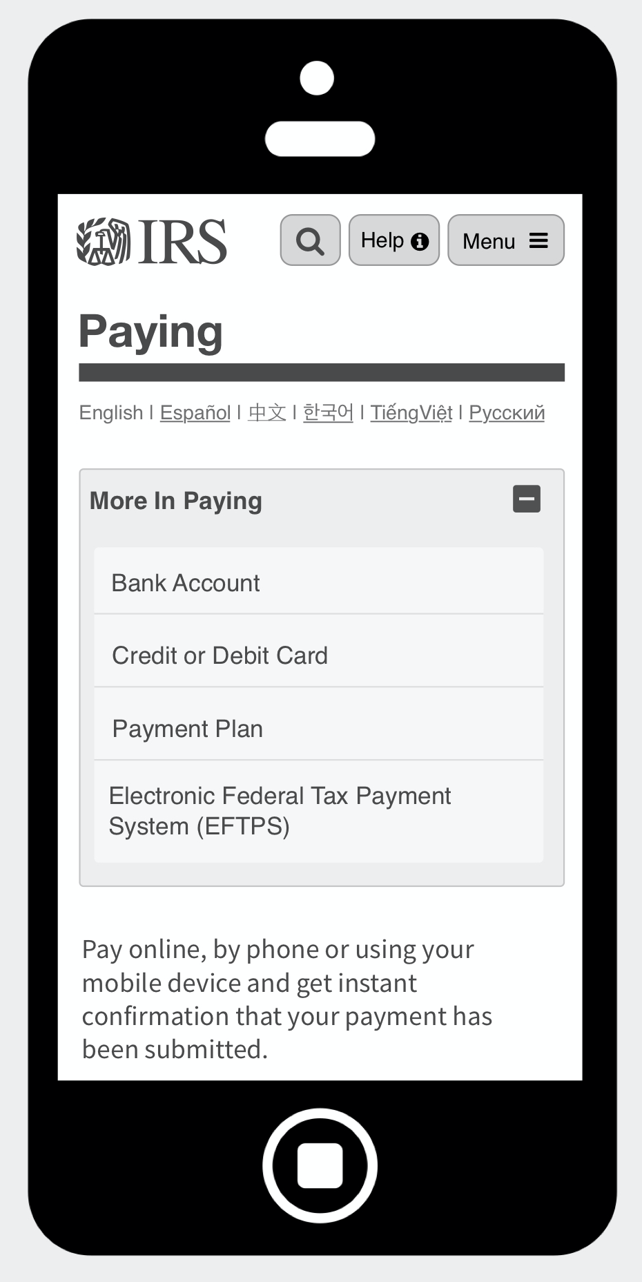
Navigation experience through devices
With preparation for usability testing, I had to quickly wireframe the navigation experience to gather insights from our initial hypothesis.
What we want to know
The team wanted to discover if the primary navigation and secondary navigation is understandable
Is the information architecture consistent through other devices
Is the user finding what they need
Testing executive summary
The team was able to partner with Media Barn to facilitate the usability testing with prototypes that we created. The partnership was a great start for future testing initiatives IRS will execute.
Respondents liked the redundancy of the buttons on the homepage in conjunction with the top navigation drop-down menus. They described the buttons as being more direct, while the drop-down menus offered more choices and detail.
A few of the respondents commented that the homepage did not feel like a typical website homepage because of the presence of so many links.
Some respondents said they had visited IRS.gov to get information on which tax form to file.
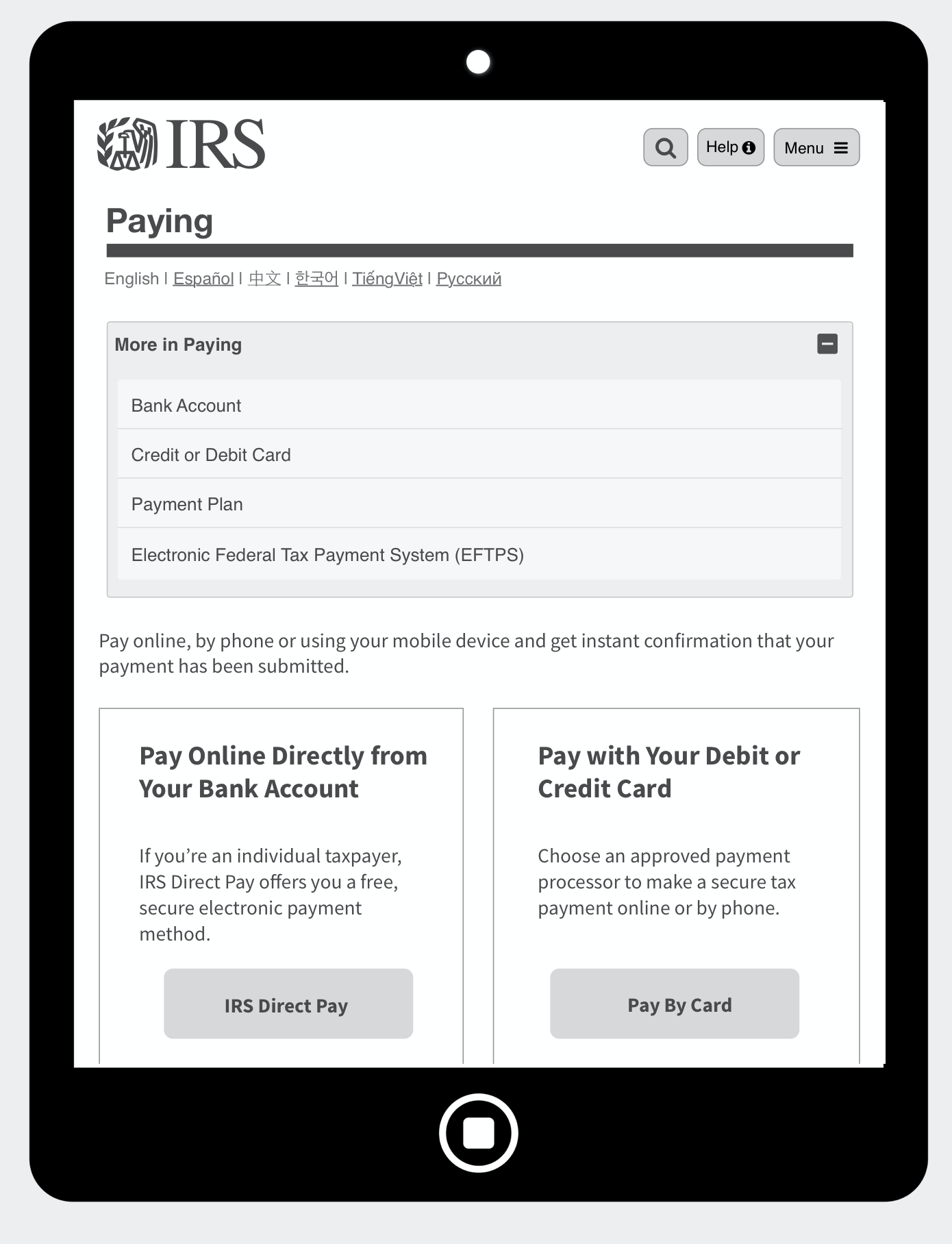
The search bar stood out well on the desktop. Most respondents assumed that the magnifying glass would lead to search on the tablet or smartphone.
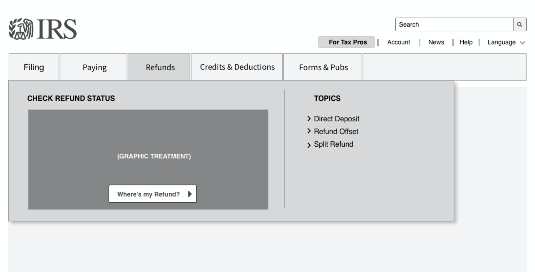
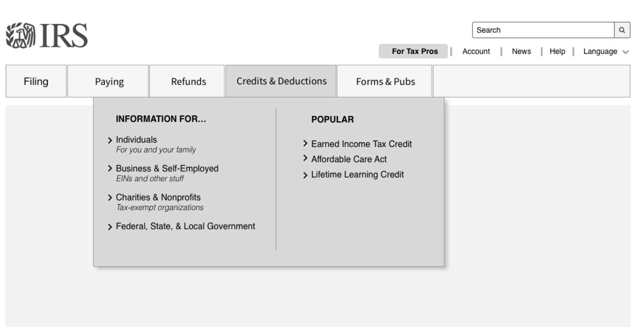
A few noticed and appreciated the Credits & Deductions tab on the desktop that did not appear on the tablet or smartphone.

Mockups and specifications
As one of our major deliverables, I was able to assist and take action on the high-fidelity mockups. Having a proper consistent specification, a measurement system for the grids and margins is really important for a design to visually appear consistent across the board. In creating this, we are able to create a design that follows a layout that can be adapted easily in design and development.


Ready for tax season and more validation
The team is prepared to capture data for the new navigation for upcoming tax seasons. This will be a test for the U.S. public to see how they would feel and experience the new designs. After each tax reason, IRS will be prepared to iterate with newly discovered data from each tax season. This redesign is also flexible to interact content types for the new CMS integration—with governance this will be a powerful transition for the IRS.